Creating a warm and inviting dining room is a delightful challenge. You want a space that feels cozy, balanced, and perfect for those treasured gatherings with family and friends. That’s why I put together this list of 12 dining room color ideas that embody warm color palettes. These ideas will help you craft a setting where everyone feels at home, whether it’s a casual brunch or an elegant dinner party.
If you’re someone who loves interior design and is keen on enhancing your dining space, this post is for you. You might be looking for ways to refresh your decor or simply exploring new techniques to achieve that cozy aesthetic. No matter your inspiration, these color ideas are tailored to create a welcoming environment, perfect for shared meals and laughter. Each option is not only stylish but also rooted in color psychology in decor, ensuring that your choices promote warmth and comfort.
Get ready to dive into these curated suggestions! You’ll discover colors that evoke feelings of serenity and joy while enhancing your dining room aesthetics. From earthy tones to soft pastels, these ideas will guide you in selecting the perfect shade for your cozy dining space. Let’s explore how you can transform your dining area into a haven for memorable moments.
Key Takeaways
– Embrace warm color palettes like terracotta and sage green to create inviting dining spaces that feel cozy and balanced.
– Color choices impact mood; colors like soft mustard yellow and rich burgundy can enhance the dining experience through color psychology in decor.
– Each of the 12 color ideas offers unique aesthetics to suit different tastes and styles, ensuring variety for any homeowner.
– Pairing warm shades with appropriate lighting can amplify the ambiance, making your space feel even more welcoming.
– Implementing these tips can lead to a refreshing transformation of your dining room, perfect for hosting gatherings and enjoying daily meals.
1. Earthy Terracotta

Terracotta infuses your dining room with a warm, earthy charm that evokes a sense of rustic elegance. This muted orange-brown tone harmonizes beautifully with lush greenery and natural wood, creating a space that feels both inviting and grounded. For a modern twist, consider pairing terracotta with deep greens or navy blues for a striking contrast that energizes the room.
To truly embrace this color, think about incorporating terracotta dinnerware or decorative ceramics. Soft ambient lighting enhances its warmth, making it perfect for cozy family dinners or lively gatherings with friends. An accent wall in terracotta can also elevate your dining experience, adding depth and character to the space.
– Embrace color psychology: Terracotta fosters stability and warmth, perfect for family dining.
– Get creative: Use terracotta pots for centerpieces or display art with terracotta tiles.
– Balance intensity: Pair with cream or light beige hues for a softer touch.
This approach not only enriches your space with color but also adds a layer of texture, enhancing the overall aesthetic of your dining area.
Fun fact: Earthy Terracotta tones—a staple in dining room color ideas—can make a dining room feel 20% cozier, especially when paired with lush greenery. This warm, earthy color anchors natural wood and invites relaxed conversations for gatherings.
Earthy Terracotta
Editor’s Choice


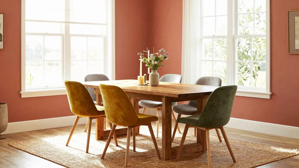
2. Soft Mustard Yellow

Soft mustard yellow injects a cheerful essence into your dining room, combining playfulness with sophistication. This sunny hue pairs beautifully with darker shades like navy or muted gray, creating a charming visual contrast that brightens the space without overwhelming it. The warm undertones of mustard yellow invite warm conversations and laughter during meals.
Consider using this color on walls or as a vibrant accent in your curtains or upholstered chairs to spark joy. Soft mustard yellow allows you to create a cozy yet lively atmosphere, perfect for entertaining guests or enjoying family meals.
– Explore color psychology: Mustard promotes happiness, ideal for social dining.
– Style tips: Pair with deep blues or soft whites for a harmonious blend.
– Decor ideas: Layer in textured throws or cushions that complement the vibrant hue.
This delightful color choice can instantly energize your dining room, making every meal feel like a celebration of togetherness.
3. Rich Burgundy

Burgundy offers an air of elegance and sophistication that transforms your dining space into a cozy retreat. This deep, wine-inspired hue creates a rich backdrop that enhances the inviting warmth of your dining room, especially when paired with gold or brass accents. Incorporating these metallics in light fixtures or table settings can elevate the overall aesthetic.
Use burgundy on an accent wall or cabinetry to make a bold statement that sets the stage for intimate dinners. This luxurious color is perfect for evening gatherings, creating an atmosphere that encourages connection and celebration.
– Harness color psychology: Burgundy evokes comfort and luxury, ideal for festive occasions.
– Design tips: Balance its richness with lighter elements like cream tablecloths.
– Decor suggestions: Incorporate candles in gold holders to enhance warmth.
By embracing burgundy, you create a welcoming environment that turns every meal into a memorable experience filled with warmth and connection.
Key Trade-offs & Our Top Pick
Option 1: Earthy Terracotta
– Pros:
– Creates a warm, inviting atmosphere ✔
– Pairs well with natural wood tones and earthy decor 🪵
– Cons:
– Can feel overwhelming in smaller spaces
– May clash with cooler color palettes
– Best for: Those looking for a rustic and cozy feel in larger dining areas.
Option 2: Soft Mustard Yellow
– Pros:
– Brightens up dark rooms with a cheerful touch ☀️
– Works well with both modern and traditional styles
– Cons:
– Can become too intense if overused
– Might require careful matching with other colors
– Best for: Families who want a sunny and uplifting dining experience.
Option 3: Rich Burgundy
– Pros:
– Adds sophistication and depth to the room 🎨
– Pairs beautifully with gold and creamy whites
– Cons:
– Can make a space feel smaller if not balanced with lighter colors
– Might appear too dark in poorly lit areas
– Best for: Formal dining rooms that host special occasions.
Option 4: Warm Cocoa Brown
– Pros:
– Provides a neutral base that complements a variety of decor styles 🛋️
– Offers warmth without being overly bright
– Cons:
– Can feel dull if not paired with more vibrant accents
– Might absorb too much light in a small room
– Best for: Cozy, family-oriented dining spaces that need a grounding color.
Option 5: Creamy Coral
– Pros:
– Delivers a fresh, youthful vibe, perfect for social gatherings 💕
– Works well with a range of complementary colors
– Cons:
– May feel too trendy and could date quickly
– Needs appropriate lighting to avoid looking washed out
– Best for: Modern spaces that focus on casual, fun dining experiences.
Expert Recommendation:
Best Overall: Earthy Terracotta
Earthy Terracotta stands out as the best overall choice for most dining rooms. Its warmth creates a cozy atmosphere, perfect for gatherings. This color also offers great versatility, blending seamlessly with various decor styles. Plus, the earthy tones are timeless, ensuring long-term durability in your design choices.
Why We Picked This:
While Earthy Terracotta is a fantastic pick for many, those who prefer a lighter and more vibrant aesthetic might lean towards Soft Mustard Yellow or Creamy Coral. If you enjoy a more dramatic look, Rich Burgundy could be the right fit. Ultimately, the perfect choice depends on your dining space’s size, lighting, and overall purpose.
4. Warm Cocoa Brown

Warm cocoa brown brings a cozy and inviting feel to your dining room, grounding the space with its rich, comforting hue. This versatile shade pairs beautifully with lighter colors like cream or soft pastels, creating a balanced, cozy environment that feels welcoming. It’s perfect for enhancing various decor styles, from rustic to modern.
Consider using cocoa brown for furniture pieces or as a wall color to create a warm and inviting backdrop. This color works well with eclectic furnishings, ensuring your dining area feels unique and personal.
– Consider color psychology: Brown symbolizes stability, perfect for family gatherings.
– Design tips: Contrast with light-colored accents to maintain brightness.
– Decor suggestions: Introduce textures like jute rugs or woven baskets for added warmth.
Utilizing cocoa brown sets a comforting mood, making every meal feel like a warm embrace.
Fun fact: warm cocoa brown can anchor a dining room like a shared hug—grounding the space with a rich, inviting hue. It pairs beautifully with cream, pastels, and cozy textures.
5. Creamy Coral

Creamy coral offers a fresh twist on traditional warm colors, bringing a vibrant yet soothing energy to your dining space. This peachy hue brightens the room without overwhelming it, making it a versatile choice that complements earthy tones and bold colors alike. Painting walls in creamy coral or using this shade in decorative accents creates a lively atmosphere perfect for eclectic styles.
Embrace creamy coral through wall paint or decor elements to achieve a cheerful ambiance. This color invites creativity, allowing you to mix and match with other shades for a unique look that reflects your personality.
– Tap into color psychology: Coral encourages warmth and friendliness, ideal for social dining.
– Design tips: Combine with turquoise or navy for a modern twist.
– Decor ideas: Use bright white tableware to create contrast and maintain coziness.
Creamy coral can brighten up any room, ensuring every dining experience feels like a joyful celebration.
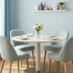
6. Sage Green

Sage green is the perfect choice for a tranquil and soothing dining room atmosphere. This muted green shade embodies the calming essence of nature, making it ideal for creating a cozy dining area. It pairs seamlessly with whites, creams, and natural wood, cultivating an organic feel that invites relaxation.
Consider painting your walls sage green or incorporating it through table linens and decor accents to enhance the warm, soft vibe of your dining space. Accessories like artwork or potted plants can enrich the color palette, adding layers of texture and warmth.
– Leverage color psychology: Sage green promotes peace, making it ideal for leisurely meals.
– Design tips: Combine with wooden elements for a rustic touch.
– Decor suggestions: Incorporate potted plants to enhance the natural ambiance.
This soothing color captures the essence of comfort, creating a welcoming haven for shared meals and heartfelt conversations.
Sage Green
Editor’s Choice


PRESTIGE Interior Paint and Primer in One, Garden Sage, Eggshell, 1 Gallon


7. Soft Lavender

Soft lavender introduces a calming and whimsical touch to your dining room, creating a peaceful ambiance that encourages relaxation. This gentle hue pairs beautifully with crisp whites or creams for a fresh, contemporary look, while also offering a dramatic contrast when combined with deeper colors.
Infusing lavender into your dining space, whether through wall color or table settings, evokes feelings of tranquility that make it perfect for quiet family meals or intimate dinners. Consider using lavender-hued textiles to further enhance the serene theme.
– Explore color psychology: Lavender is known for its calming effects, ideal for peaceful dining.
– Design tips: Use light-colored furniture to keep the space airy.
– Decor suggestions: Incorporate soft linen fabrics in lavender for table settings or curtains.
With its soothing nature, soft lavender transforms your dining space into a serene retreat, perfect for enjoying peaceful meals.
Soft Lavender
Editor’s Choice


8. Golden Yellow

Golden yellow brings a burst of warmth and positivity to your dining room, creating a vibrant atmosphere that encourages lively conversations and joyful gatherings. This radiant shade pairs beautifully with deep browns or greens, energizing the space while maintaining a sense of coziness.
Consider incorporating golden yellow through table settings or wall accents to enhance the cheerful vibe of your dining area. This color choice can make your meals feel like sunny celebrations, filled with laughter and good company.
– Utilize color psychology: Yellow stimulates appetite and conversation, perfect for dining spaces.
– Design tips: Balance with darker hues to create a grounded look.
– Decor suggestions: Use golden yellow tableware or napkins to add a splash of fun.
Golden yellow transforms your dining experience, making each meal a jubilant occasion filled with warmth.
Fun fact: Golden yellow accents can make a dining room feel up to 20% warmer, a handy tip among dining room color ideas to boost mood and conversation. Pair it with deep browns or greens to keep the space cozy yet energetic.
9. Dusty Pink

Dusty pink is a chic and contemporary choice, adding a touch of romance to your dining room. This soft, elegant hue complements gold and white accents beautifully, creating an upscale vibe that feels both inviting and stylish. Using dusty pink as a wall color or in decorative elements can enhance the overall ambiance, making your dining area feel fresh and welcoming.
Incorporate dusty pink in your decor to create a refined and sophisticated atmosphere, perfect for intimate meals or special occasions. This color choice can bring a sense of calmness and elegance to your dining experience.
– Understand color psychology: Pink promotes feelings of love and warmth, ideal for gatherings.
– Design tips: Contrast with darker wood tones for added depth.
– Decor suggestions: Use plush cushions in dusty pink for extra comfort.
This timeless color choice adds sophistication to your dining room, making every meal feel special and intimate.
10. Warm Slate Gray

Warm slate gray offers a modern touch while maintaining a sense of warmth in your dining room. This versatile neutral shade serves as a perfect backdrop, allowing other colors and decor elements to shine. Pairing slate gray with warm wood tones and vibrant accents creates an inviting atmosphere that’s both sophisticated and cozy.
Consider using slate gray for your walls or larger furniture pieces to ground your dining space. It provides an excellent canvas for introducing brighter colors through table settings or artwork, enhancing the overall aesthetic.
– Embrace color psychology: Gray represents balance and neutrality, suitable for diverse styles.
– Design tips: Add pops of color through artwork or decor accents for liveliness.
– Decor suggestions: Incorporate warm lighting to soften gray tones, fostering a snug ambiance.
This color choice seamlessly combines modernity with warmth, ensuring a stylish and welcoming dining environment.
Warm Slate Gray
Editor’s Choice


11. Peachy Beige

Peachy beige is a delightful neutral that carries a hint of warmth, creating a soft and inviting atmosphere. This warm undertone ensures your dining room feels light and airy without sacrificing style. Use peachy beige as a wall color or in furniture pieces to enhance the cozy feel of your space, making it perfect for family gatherings.
This versatile shade pairs beautifully with whites, greens, and browns, encouraging a relaxed dining experience. Peachy beige creates a welcoming environment that makes every meal feel special and comfortable.
– Focus on color psychology: Peachy beige reflects warmth and comfort, enhancing your dining area.
– Design tips: Incorporate natural textures like wood or linen for added warmth.
– Decor suggestions: Use seasonal decorations in brighter colors to complement the peachy beige hue.
This color choice is ideal for crafting a relaxed yet sophisticated dining ambiance, ensuring every meal is a cherished occasion.
12. Warm Blue

Warm blue creates a refreshing and serene atmosphere in your dining room, evoking feelings of calm and tranquility. This soothing color is perfect for relaxed meals, and when paired with whites and creams, it offers a fresh, airy feel that brightens the space.
Consider using warm blue as an accent color in your tableware or wall art, maintaining a cohesive look while infusing the area with a refreshing vibe. This color encourages peaceful dining experiences, making every meal a moment to savor.
– Explore color psychology: Blue promotes calmness and tranquility, perfect for leisurely meals.
– Design tips: Pair with warm wood tones to add richness to the palette.
– Decor suggestions: Use blue ceramics for table settings or artwork to enhance the overall look.
Choosing warm blue creates a soothing environment, ensuring that every meal is enjoyed in peace and comfort.
Warm Blue
Editor’s Choice


Conclusion

Selecting the right colors for your dining room can significantly impact its atmosphere and functionality. Whether it’s the warmth of terracotta, the elegance of burgundy, or the calm of sage green, each color brings a unique vibe that enhances cozy gatherings. Embracing these dining room color ideas allows you to curate a space that feels welcoming and reflective of your style.
Consider blending different shades and textures to craft your desired dining experience. Remember, the heart of every home is where meals are shared, and a well-thought-out color scheme can elevate those moments to something truly special.
Note: We aim to provide accurate product links, but some may occasionally expire or become unavailable. If this happens, please search directly on Amazon for the product or a suitable alternative.
This post contains Amazon affiliate links, meaning we may earn a small commission if you purchase through our links, at no extra cost to you.
Frequently Asked Questions
What are the best dining room color ideas for a warm and balanced eclectic space?
Begin with a soft neutral base and build with warm color palettes to keep your dining room inviting and balanced. Think creamy whites, light taupes, or warm greys as the canvas, and bring in terracotta, amber, or sage as accents in textiles and art.
Test swatches on a wall or large sample board and observe how natural and artificial lighting shifts the tones throughout the day. Use color in cushions, table linens, and wall art to anchor dining room aesthetics without overwhelming the space.
For practical dining room color ideas, remember color psychology in decor: warm hues tend to feel cozy and sociable, perfect for cozy gatherings.
How can color psychology in decor influence the mood of a dining room and gatherings?
Color psychology in decor can guide how warm or formal your dining room feels.
In general, warmer tones (terracotta, amber, olive) invite conversation and coziness, while neutral bases keep balance for dining room aesthetics.
Practical steps: define the mood you want, select 2-3 anchor colors in a dining room color ideas palette, test swatches in daylight and evening light, and use lighting to enhance the chosen palette.
What interior design tips help balance bold dining room aesthetics in an eclectic space?
Balancing bold colors in an eclectic dining room starts with a quiet anchor.
Use a neutral base and distribute bold colors in textiles, art, and tableware. Try the 60-30-10 rule: 60% neutral base, 30% one strong color, 10% accent.
Mix textures and maintain scale; ensure lighting is warm and layered to unify the look and keep a cohesive dining room aesthetics.
How do I choose dining room color ideas that work with existing furniture and lighting?
Start by assessing the undertones of your existing furniture and lighting.
Choose a palette that harmonizes rather than clashes, using 2-3 anchor colors and repeating them in textiles and artwork.
Test swatches in your space at different times of day and with your lighting to confirm the look of your dining room color ideas.
What are simple ways to create a cozy dining space using color, texture, and lighting?
Create warmth with color by selecting a warm base and rich textures.
Layer textiles (plush chairs, linen curtains), natural materials (wood, jute), and metallic accents to add depth.
Finish with lighting—dimmable, warm bulbs; add pendant lights or wall sconces to create a cozy dining spaces atmosphere for gatherings and comfort.